Gentle Monster
Creative Direction
Campaign
Branding & Identity
Redefining luxury by defying convention.
This project is for creative purposes. It is not officially associated with Gentle Monster.
Overview
Aposematism, the biological concept of using bright colors as a warning signal, plays a key role in this design direction for Gentle Monster.
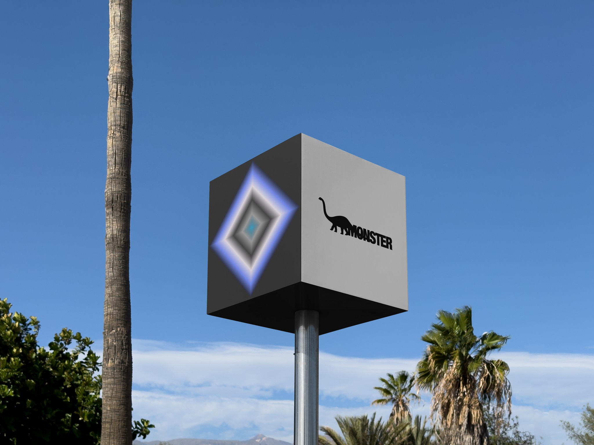
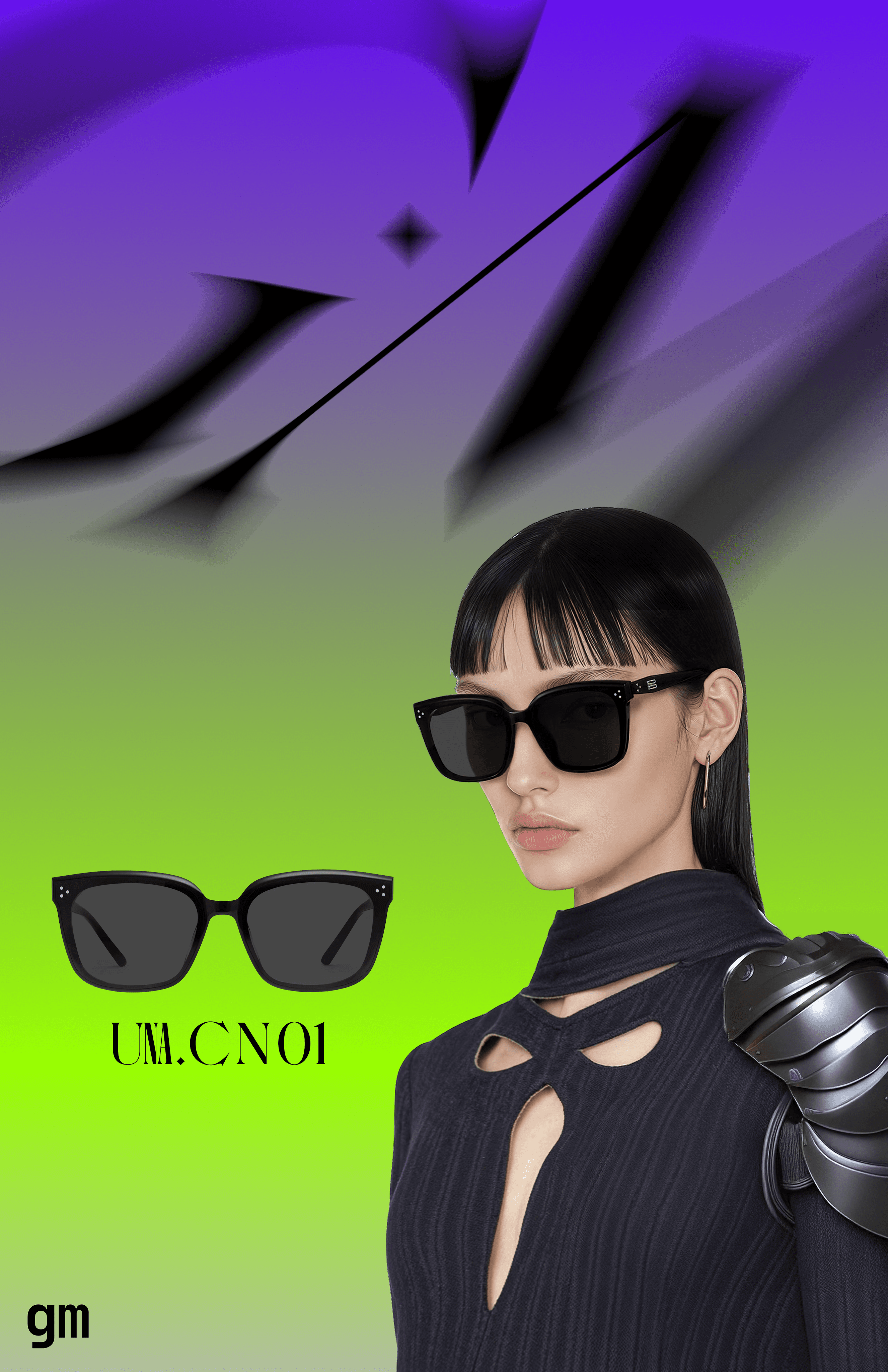
The juxtaposition of “gentle” and “monster” suggests a duality—something both inviting and dangerous. This tension is visually translated through bold, high-contrast color gradients across the visual identity.
By applying this concept, the visual identity embraces both attraction and intimidation, mirroring the paradox embedded in the name Gentle Monster.
Timeline
Q3 2024
Duration
1 week
Key Words
Neo-noir, Matrix, Code, Aposematism
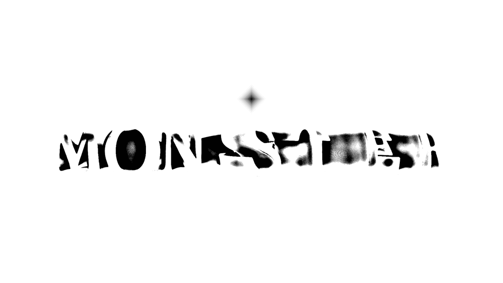
Initial Logo Concept


Typography
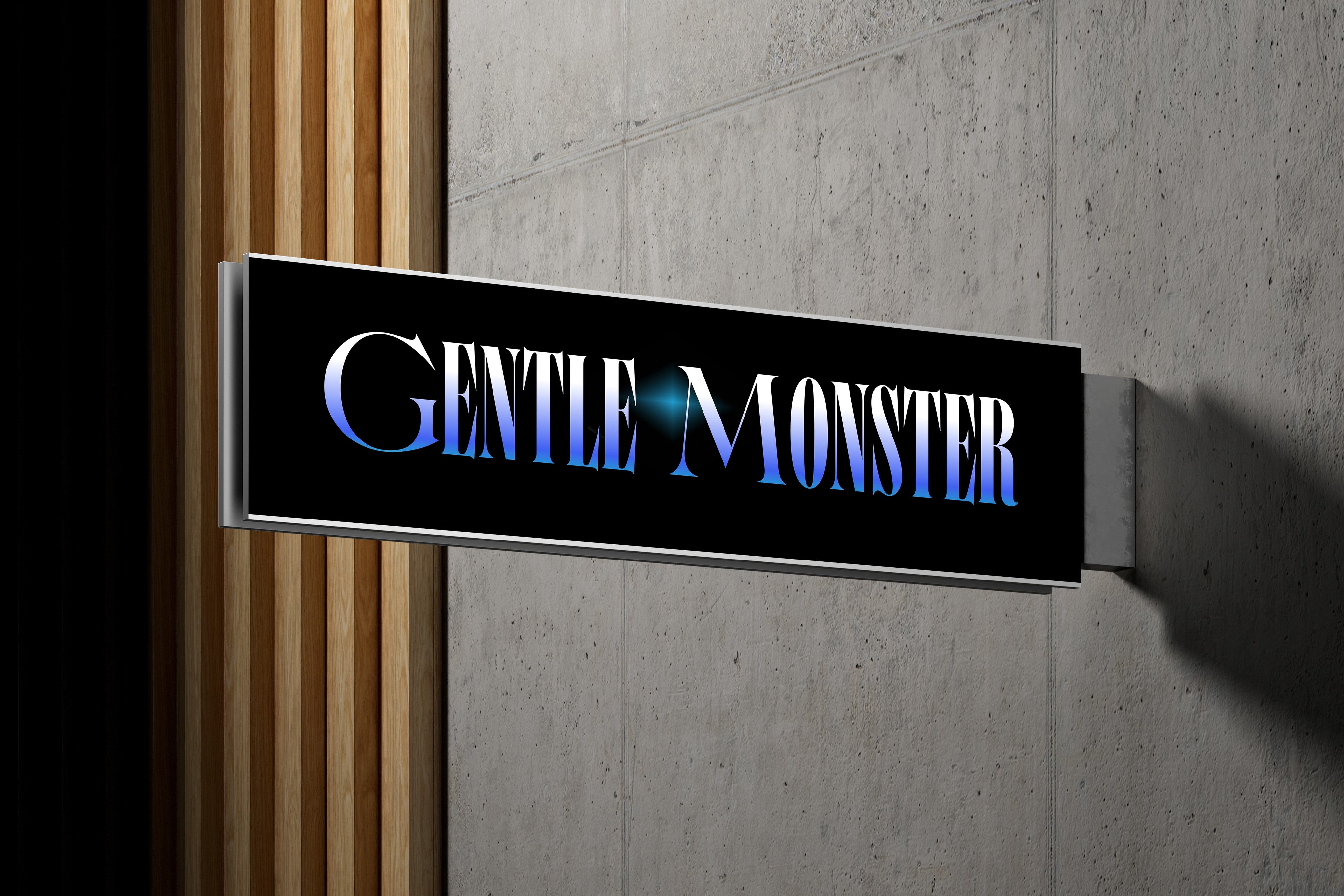
The typography and iconography are central to establishing a unique, Neo-noir aesthetic.
The serif typeface conveys timeless elegance with an underlying aggression, while the sans-serif typeface introduces modernity. The monospaced typeface provides a technical, almost digital quality, reinforcing the futuristic and structured vibe.


Art Direction
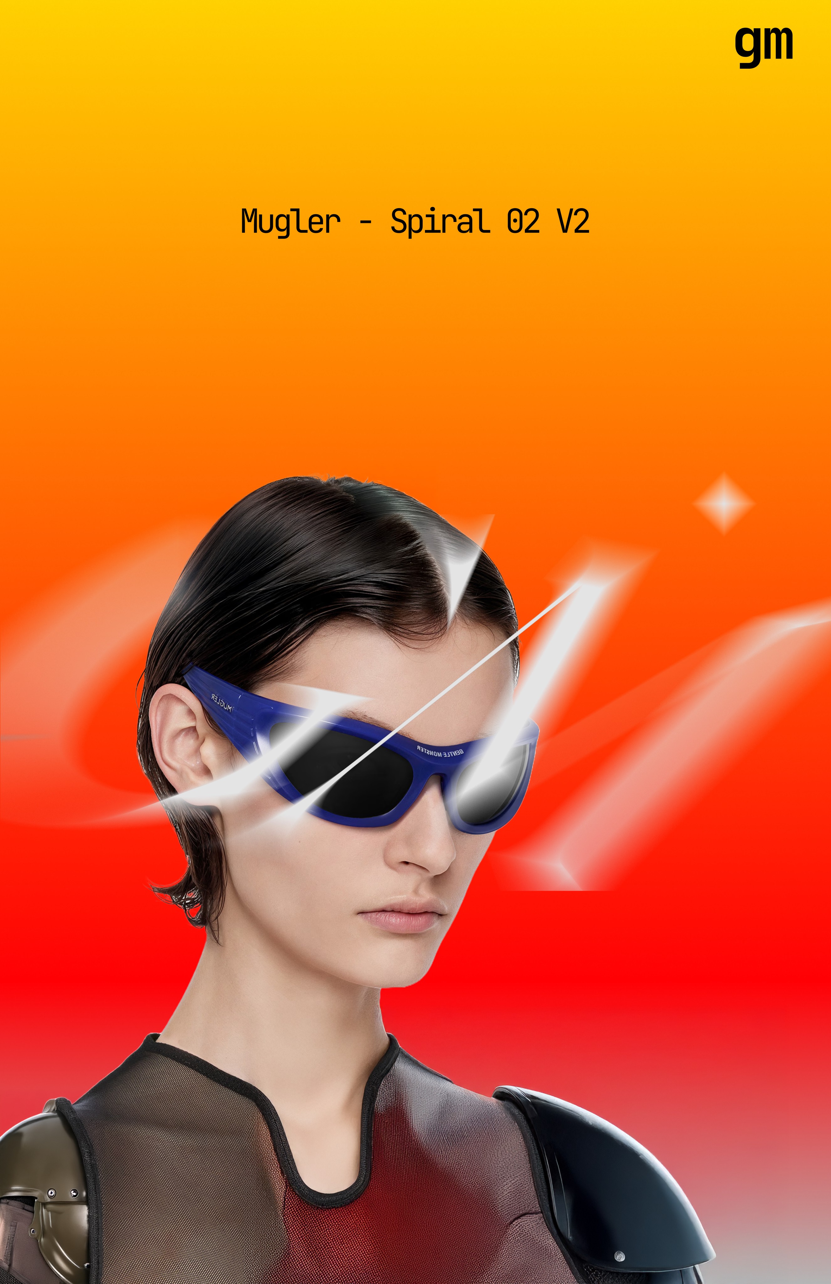
The design direction challenges traditional luxury aesthetics by making bold, unnatural color gradients a core element of the identity. Just as poisonous creatures in nature use striking colors to signal their presence, the vibrant gradients in Gentle Monster’s visual system act as a statement of defiance—impossible to ignore, yet carefully controlled in their application.


Thank you for reading!
