Skechers Rebrand
Identity Systems, Art Direction

Furthermore, their disconnect with the young adult audience poses a challenge, as Gen Z represents the future. Embracing and engaging with the youth could offer significant opportunities for Skechers to participate in sneaker culture and streetwear heritage.
Redesigned Website
introduction
The Design Problem, Low Caliber Aesthetics
Current Website
The landing page is an example of the cluttered and eclectic visuals reflected in most of their media. Features poor typographic choices, textures and bland composition choices.
SOLUTION,

The use of rectangular shapes and pointed edges represents the opposite of comfort technology to me, with the entire composition being rigid.
Conceptual Direction: Visualizing Comfort Technology
process board
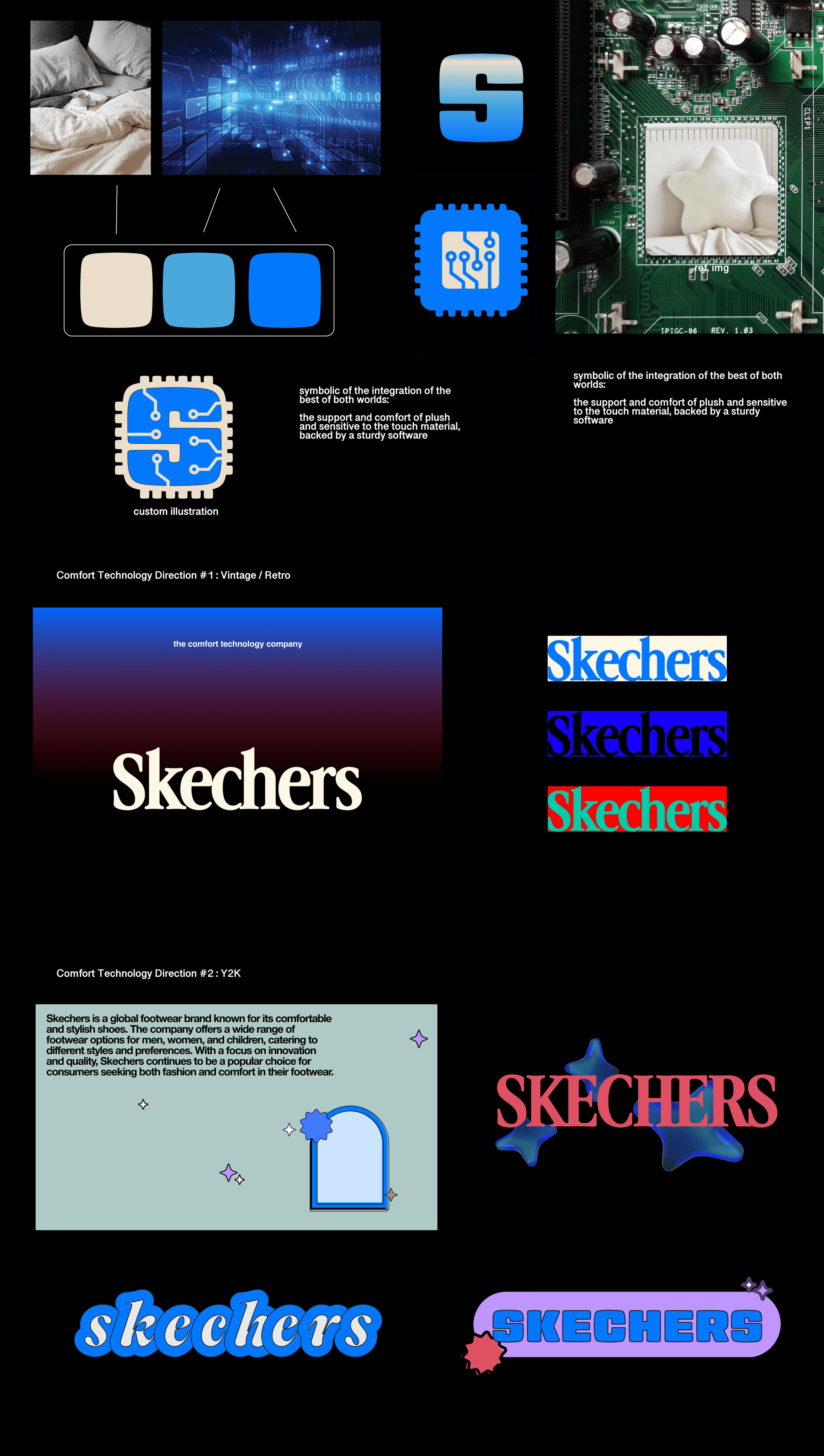
Art Direction: Plush-Tech



The Comfort Technology Company
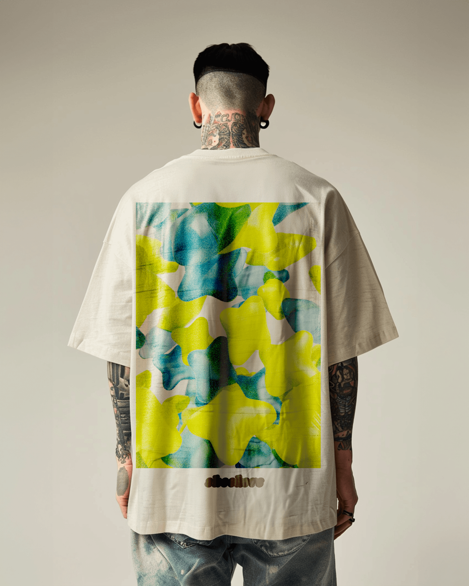
All art related to the brand's new visual direction visualizes the Skechers' primary motto, "the comfort technology company". As this is at the heart of the brand and applies to everything that they do. Primarily featuring the 4 pointed star as the recurring symbol.
